M
Design Lab 🎨
A collection of personal UI projects and real-world marketing design work, showcasing conceptual UI, brand assets, and explorations at the intersection of product identity and visual craft.
Works
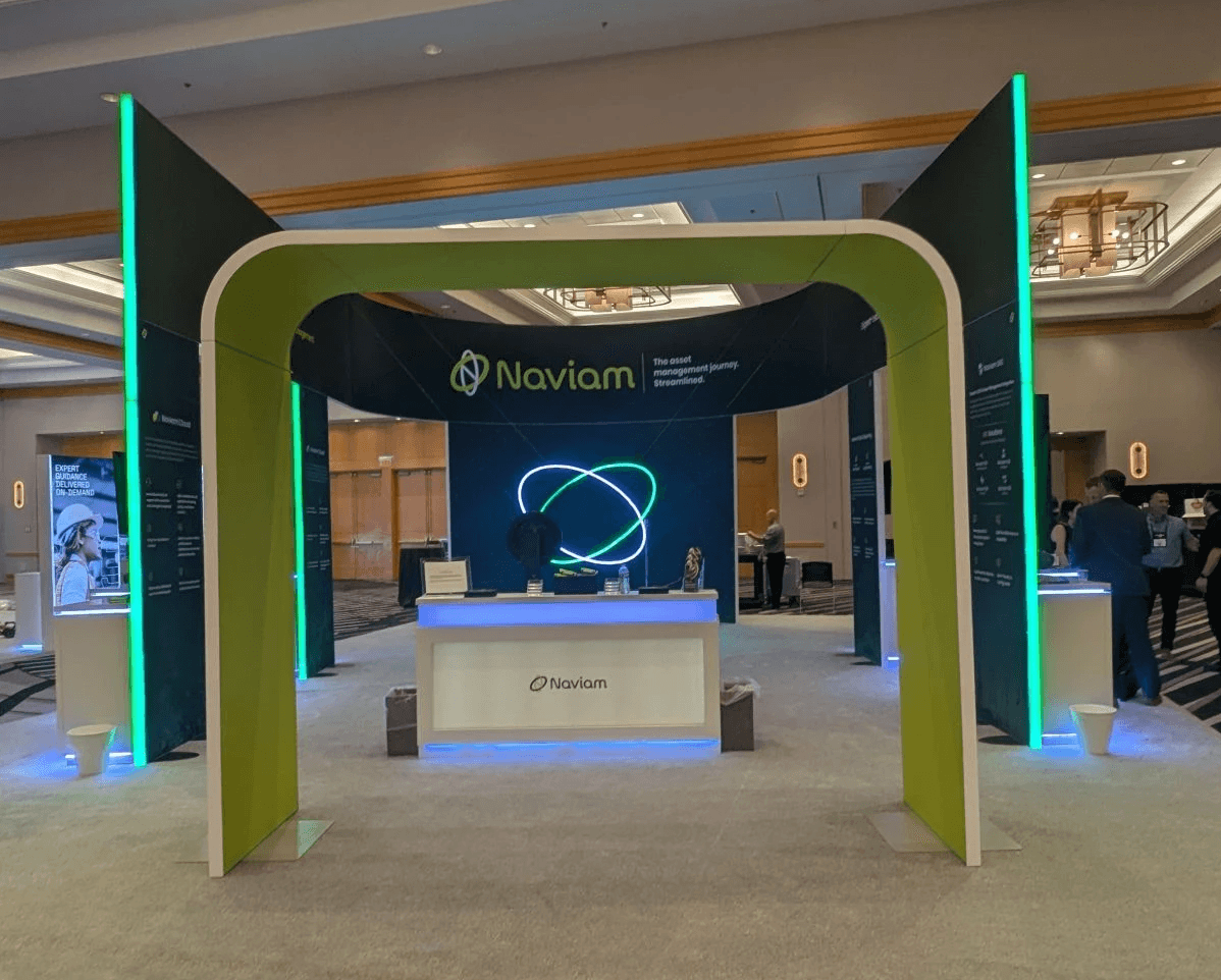
2025 | Marketing at Naviam
Booth Design
Led the design of Naviam’s large-scale trade show booth for Maximo World, translating product positioning into a physical experience. Partnered closely with sales and marketing teams to shape messaging, spatial layout, and visual storytelling to support live product conversations and brand presence.
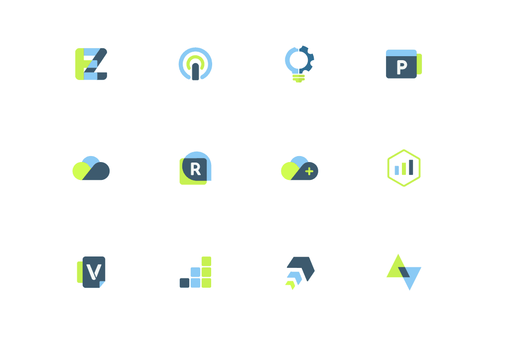
2025 | Marketing at Naviam
Naviam Logo Design
Designed 15+ product logos and brand marks across the Naviam ecosystem, establishing visual consistency while allowing each product to maintain a distinct identity within the broader platform.
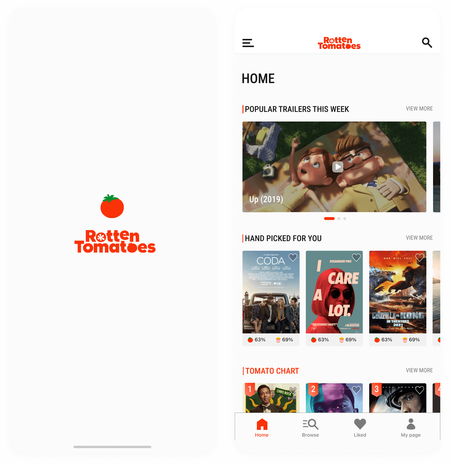
2023 | Personal Project
Rotten Tomatoes Concept Redesign
A self-initiated redesign exploring improved user flow, content hierarchy, and modernized UI patterns. Focused on simplifying movie discovery and creating a clearer browsing experience across mobile screens.
2023 | Personal Project
Dinosaur — Shared Finance Concept
A personal project exploring expense tracking between roommates, focusing on clarity in shared spending, balance visibility, and lightweight financial management through simple interaction patterns.

2025 | Personal Project
SoundScribe — AI Voice Journal Concept
Designed a voice-first journaling app that converts spoken recordings into structured daily entries, transforming raw audio into organized, diary-style reflections through thoughtful information hierarchy and interaction design.

The web is wide, I'm glad you found this corner.
Stay Connected!
©2026

ivyharin@gmail.com
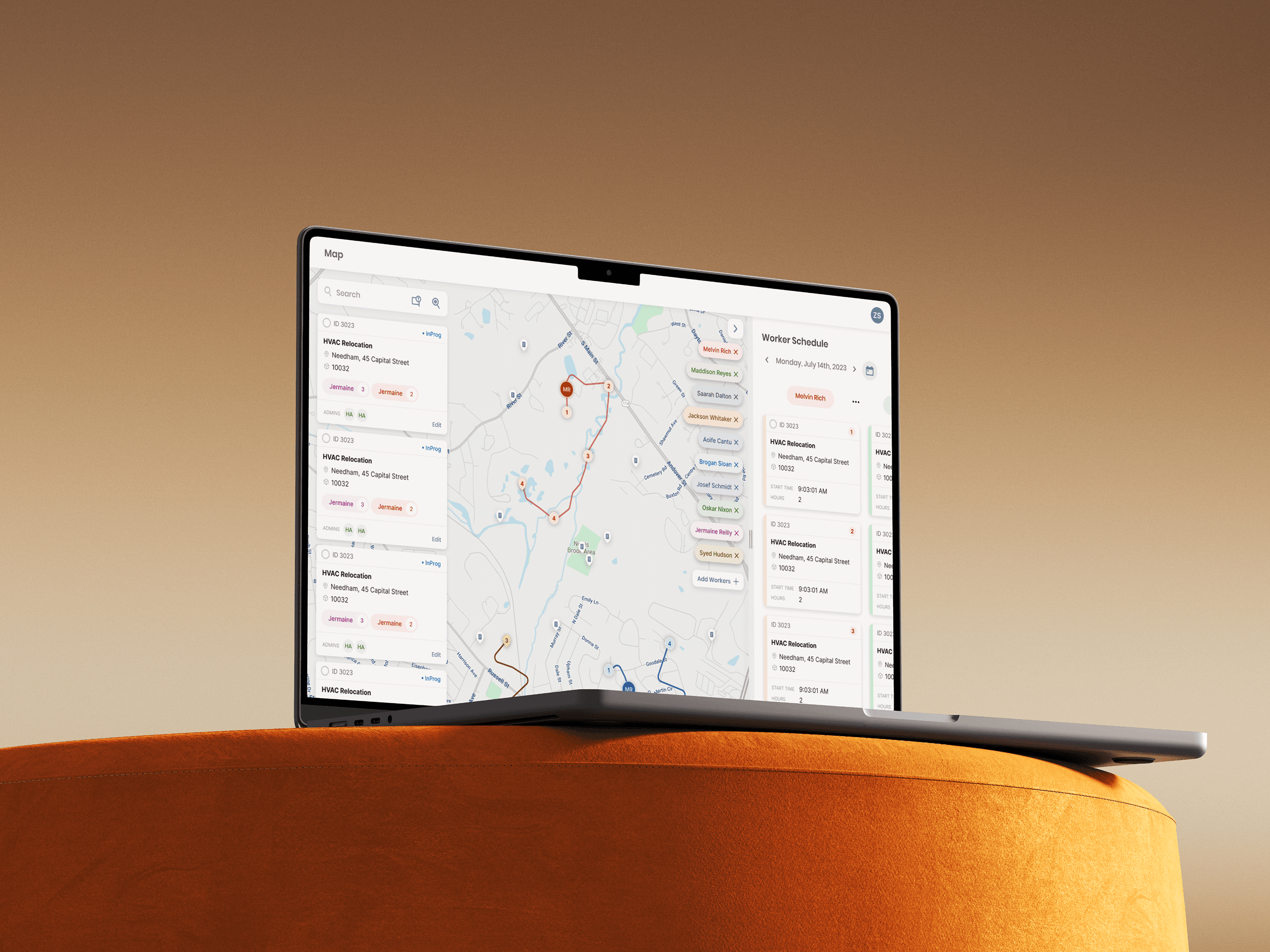
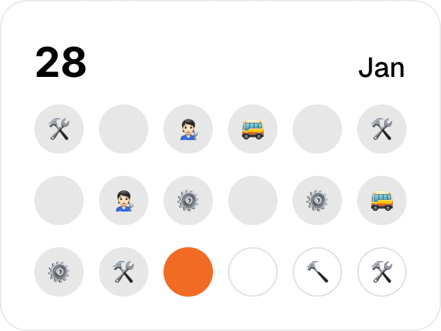
Enterprise Dispatch Planner Redesign
Simplified map-based dispatch workflows by improving spatial planning and job assignment interactions, enabling faster coordination across high-volume field operations.
Timeline
March 2023 · 3 Weeks
Role / Context
Full time Designer @Naviam
Team
2 Designer, 3 Engineers
Project Type
EAM
Web
Workflow design
Background
What is the Route Map Feature in Naviam Planner?
The Product: Naviam Planner
B2B web application for planning, scheduling, and managing field operations.

The feature: Route Map tool
This feature provides a geographic view that helps planners assign work and visualize technician routes more efficiently.

Our real world users
Field managers who dispatch large technician volumes and must balance real-time availability, geography, and strict SLAs, often under time pressure.
The Problem
Cognitive Overload and Workflow Fragmentation in High-Volume Dispatch
Disconnected panels and a static map forced manual cross-referencing, preventing workflow scalability for high-volume dispatch.
How this impacted our clients
Manual routing slowed operational throughput, increased time-to-assignment, and drove SLA risk and higher labor costs as dispatch volumes grew.
Our Design Process
Research & Validation Under Limited User Access
Designs Iterated based on…
Heuristic Auditing to surface pain-points.
Conducted heuristic evaluations to identify and resolve usability pain points.
Internal Testing to validate design.
With limited access to field users, validated key dispatch workflows through iterative internal testing with Product Managers and Engineers familiar with real operational needs.
Role & Responsibility
End-to-End Ownership
Owned the end-to-end redesign of the Route Map experience, defining core workflows, interaction models, and high-fidelity UI
Usability Validation
Validated usability through iterative prototyping and testing to refine multi-stop scheduling and route assignment flows
Cross-Functional Alignment
Led requirements meetings and design reviews with product and engineering team to shape scope and validate decisions
Implementation Partnership
Partnered closely with engineers throughout implementation, providing detailed specifications and design QA to ensure high-quality final delivery
Outcome
50% Reduction in Work-Assignment Time for High-Volume Dispatch
The redesigned Route Map provides a guided, scalable planning experience that keeps users oriented in spatial context.

Full Process starts here

01 Accelerated Activiation
Guiding users to a clear starting point
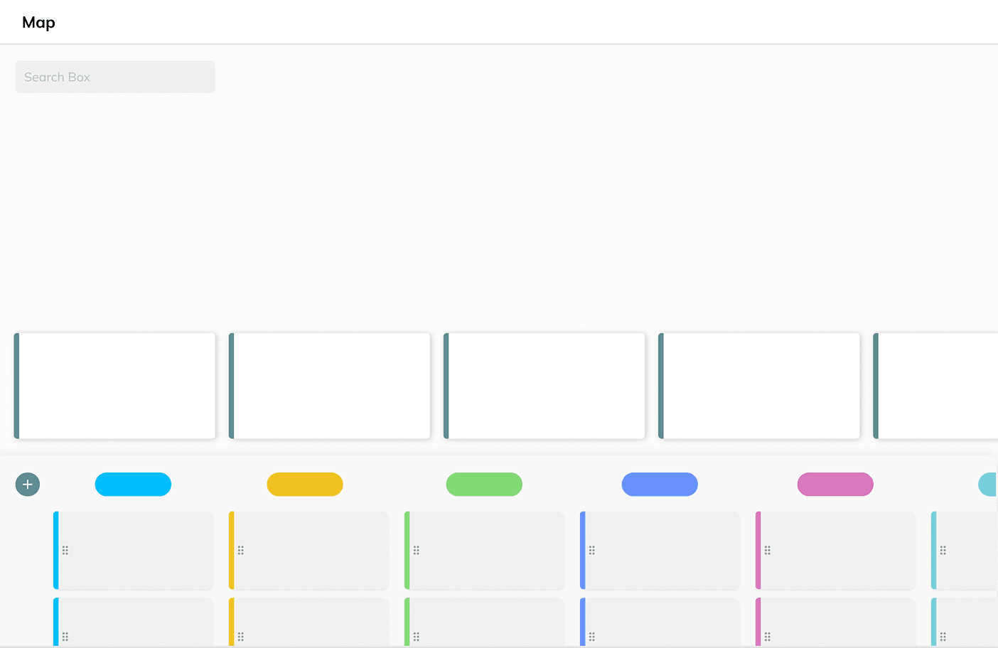
PAIN POINT
A blank map with no direction.
The initial map view offered no clear direction. The primary action of adding workers was hidden behind a small icon at the edge of the screen, creating a dead end that caused users to hesitate at the very start of their workflow.
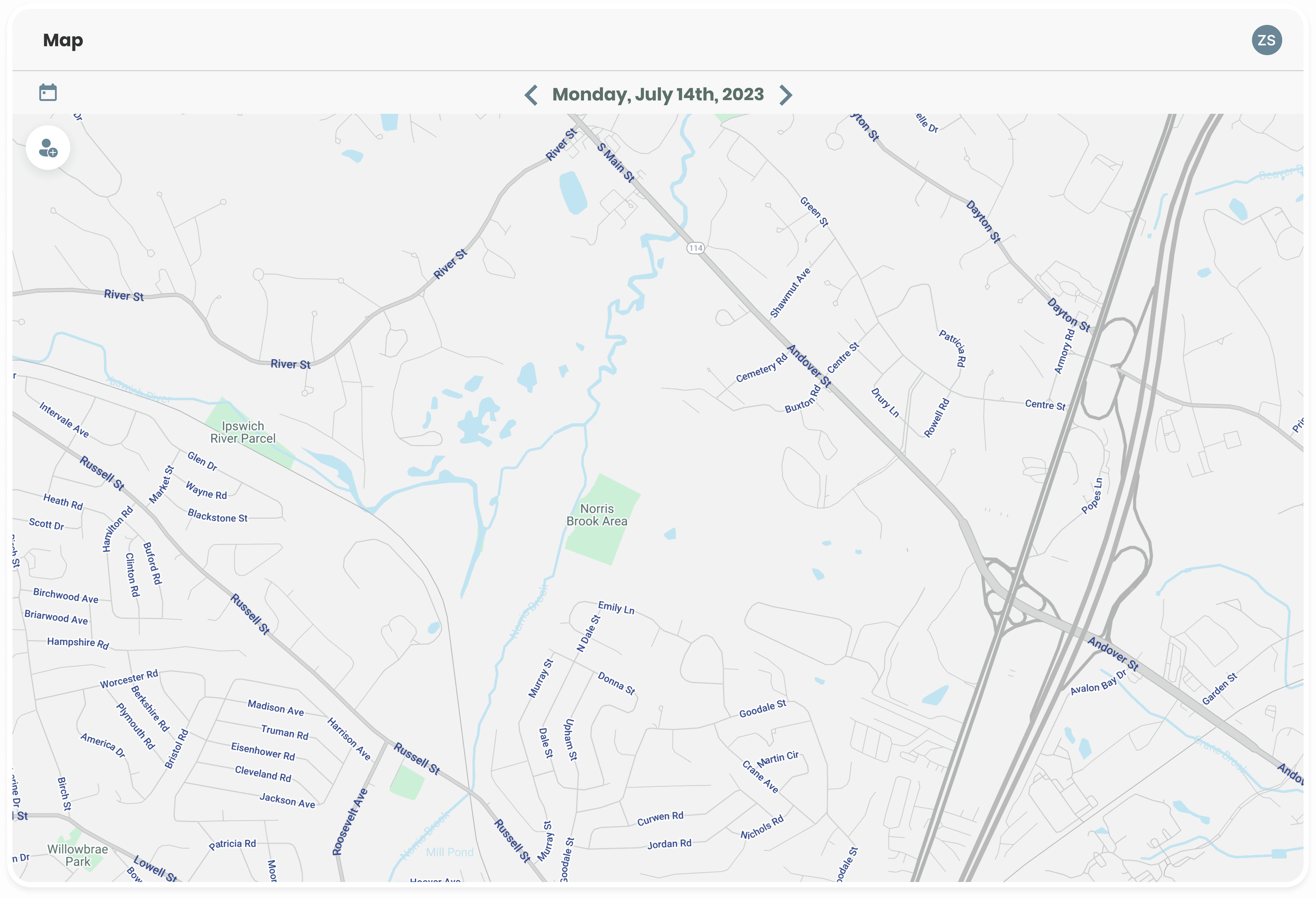
Empty state lacked
visual cues to guide
next steps
Primary entry point
visually understated
and easy to miss
Solutions Considered
01
Full Auto-population
of Worker Assignments
Strategy
Automatically load all active workers onto the map to provide immediate spatial context, mirroring consumer mapping patterns.
Why it didn't work
At scale, data volume exceeded browser rendering limits, causing severe performance issues and an unusable initial load.
02
Pre-populating only
frequently used workers
Strategy
Pre-load commonly accessed workers using historical usage data to improve initial performance.
Why it didn't work
Inaccurate assumptions required frequent manual correction, creating more overhead than starting assignments manually.
03
Functional Empty State
with Manual Selection
Selected
Strategy
Maintain manual selection while replacing the static “No Data” state with a guided empty state that prompts action.
Why we selected this approach
Deferring data loading until user selection keeps the experience fast, while the guided empty state helps users start quickly and confidently.
OUTCOME
Giving the map a clear first action
A functional empty state replaces the blank map, clearly explaining the current state and guiding users to add workers. This removes initial ambiguity and gives managers a clear, intentional starting point.
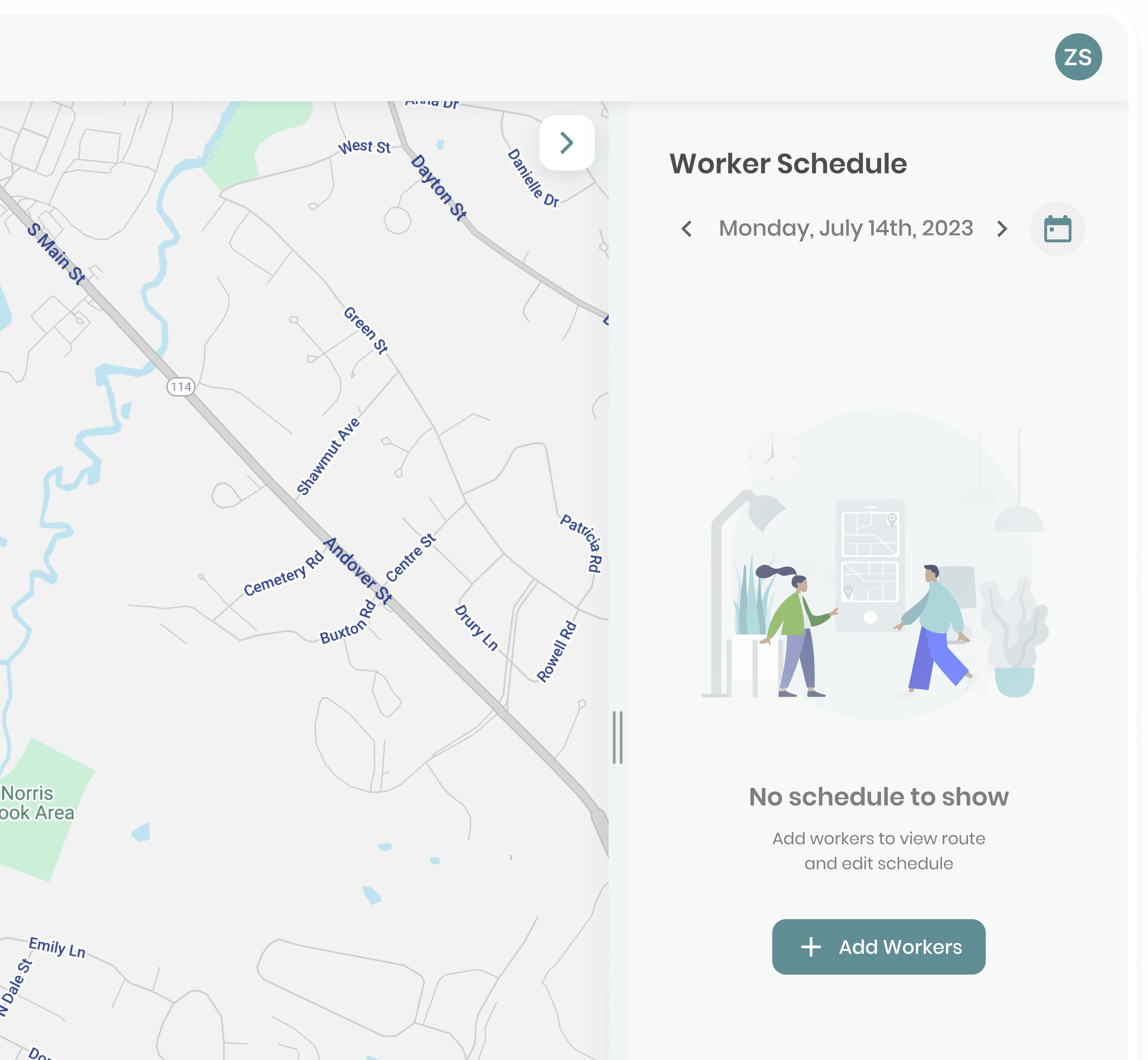
After
Explains current page state
CTA to Guide users to next step
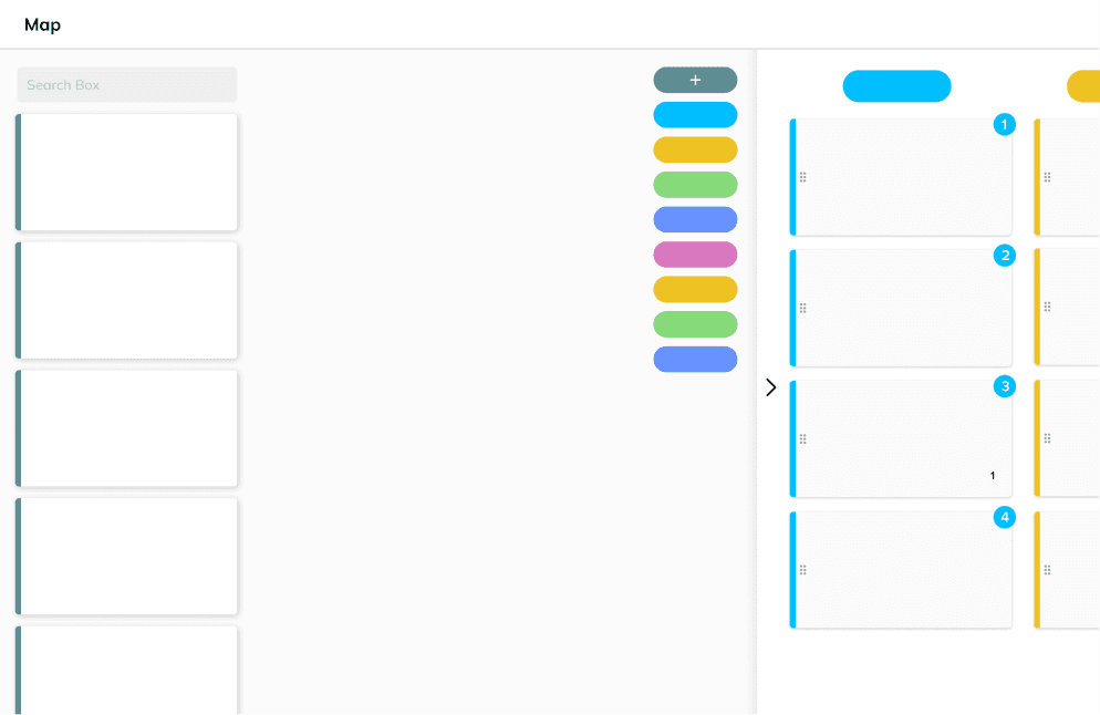
02 Information Scalability
Making layouts more discoverable & scalable for enterprise level management
PAIN POINT
Hidden Interaction
Accessing the work order list was one of the key flows. However, they were hidden behind a
long-press gesture, which made them easy to miss, especially for new users.
Long press anywhere
on screen to bring up
work order list

PAIN POINT
Clashing UI
As the dataset grew, the horizontal layout forced users to constantly scan and scroll in multiple directions. The map, worker chips, and schedules began colliding after just a few cards, increasing cognitive load and slowing comprehension.

Limited visibility due to
panel clashing
Solutions Considered
01
Fully Horizontal Layout
Strategy
Consolidate the worker list into the schedule panel using a horizontal layout to reduce UI surface area and centralize information.
Why it didn't work
Horizontal scrolling felt unnatural for dense planning tasks, slowing navigation and reducing efficiency.
02
Fully Vertical Layout
Selected
Strategy
Redesign the layout to prioritize vertical scanning and a clear spatial hierarchy across the interface.
Why we selected this approach
This approach supported high-volume data by preserving spatial clarity and mental model consistency, aligning with patterns used in large-scale planning tools.
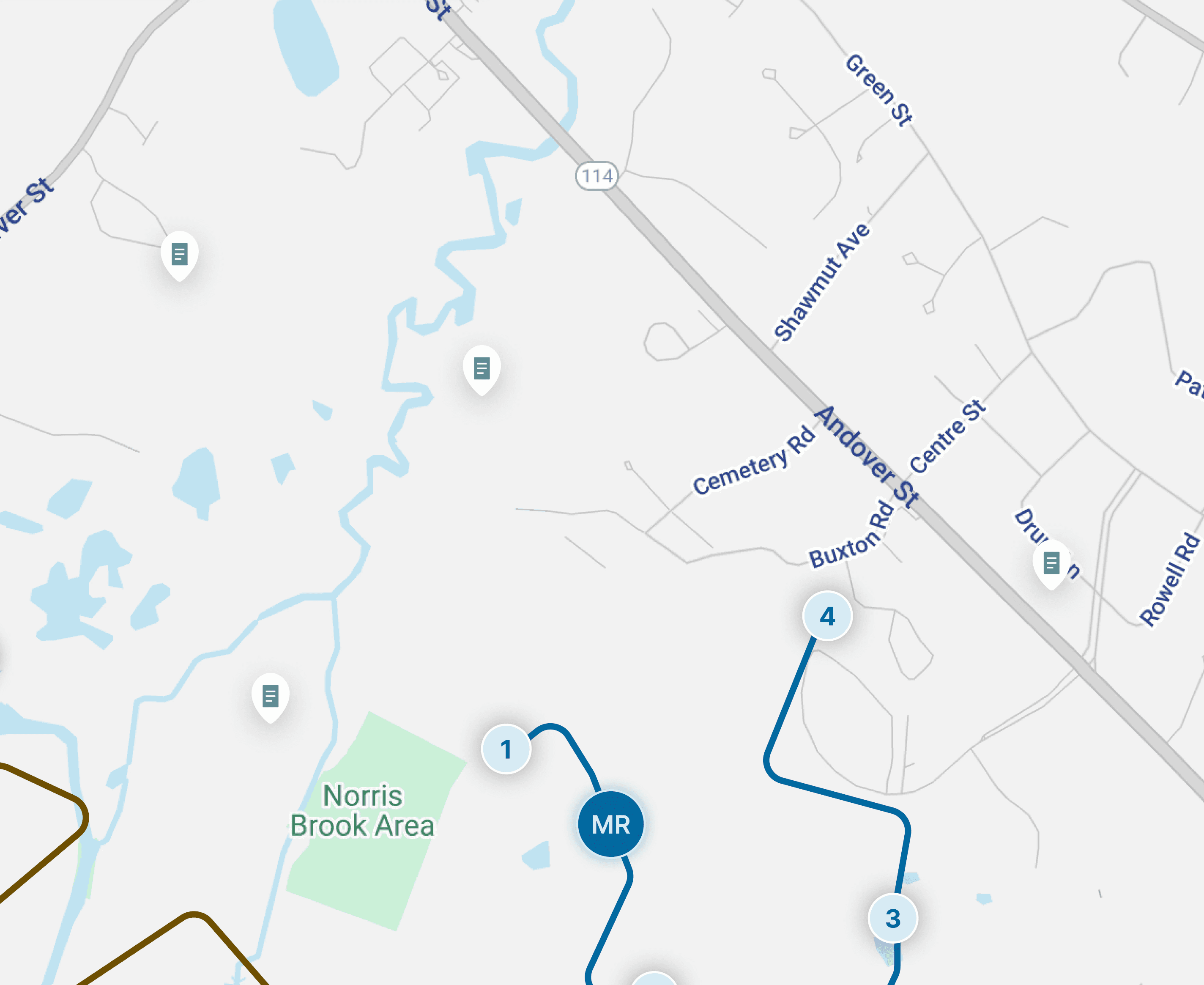
OUTCOME
Scaling through spatial clarity
I anchored the map as the persistent source of truth and introduced a searchable sidebar to make work orders instantly discoverable. Supporting panels were simplified and collapsed to remove redundancy, while a vertical hierarchy enabled faster scanning and reduced cognitive load as data density increased.
After

Work order cards optimized
for scannability
Instant work order search & filtering
Vertical layout to support efficient scanning
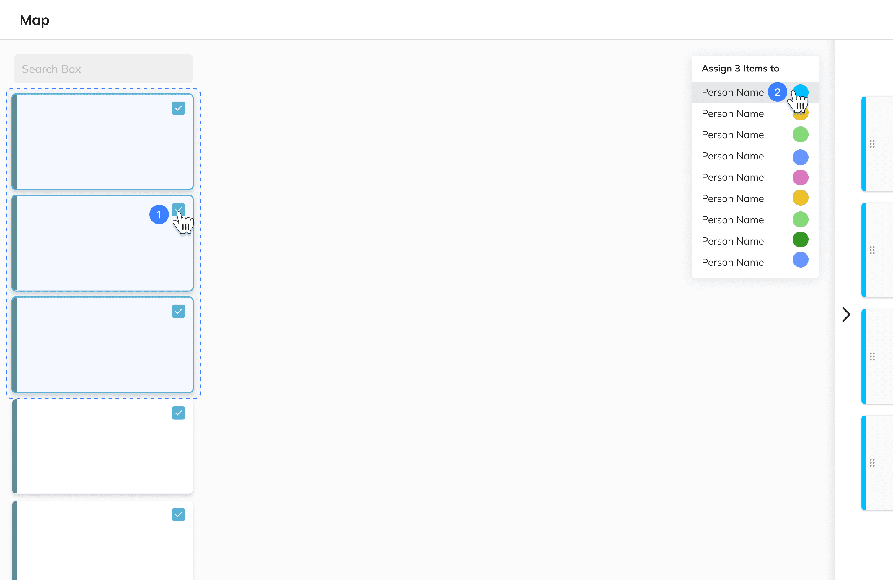
03 Workflow Continuity
Refining the Interaction : From Modal overload to contextual action
PAIN POINT
Overloaded Edit Dialog
In the original flow, selecting a work order triggered an almost full-screen modal. Reused from other parts of the system, this dialog was overly complex and completely obscured the map.
While full context can be necessary in some cases, it pushed users into a heavy “edit mode” for what was most often a lightweight assignment action, breaking spatial context and slowing the workflow.

Overly heavy dialog
for a simple task
Solutions Considered
Iteration 01
Contextual pop up

Strategy
Place a contextual pop-up next to the work order to enable fast, in-place assignment while reducing cursor travel.
Why it didn't work
The pop-up duplicated worker information already visible on the map, increasing redundancy and visual clutter.
Iteration 02
Hidden Sidebar

Strategy
Hide persistent worker chips behind a collapsible sidebar to reduce visual duplication.
Why it didn't work
Removing persistent visibility eliminated global context, forcing users to drill into individual work orders to assess availability.
Iteration 03
Assignment Mode
Strategy
Trigger a dedicated “Assignment Mode” on work order selection, allowing the worker list to both surface availability and function as the primary assignment mechanism.
Why it didn't work
Activating a separate mode introduced interaction overhead and expanded the scope of layout and interaction changes required.
Testing our Models
Heuristic evaluation alone could not resolve tradeoffs between approaches, so we validated them through structured internal testing.
Internal Research
We tested three functional Figma prototypes with six internal engineers to identify the most efficient workflow for high-density scheduling.
Participants completed the same task of assigning five work orders while we observed speed, accuracy, and interaction patterns.
Results
Redundancy as a Performance Aid
Visual redundancy between the map and sidebar did not reduce performance. It enabled faster confirmation by allowing users to verify information without shifting attention across large displays.
Workflow Optimization
Participants preferred in-context, map-based interactions over sidebar-only workflows, prioritizing speed and continuity of focus.
Final Decision
Selected
Reversion to Iteration 01 Contextual Pop up
Testing showed that removing redundancy introduced more friction than benefit. We finalized the design by re-integrating the contextual pop-up to support fast assignment while preserving spatial context.
OUTCOME
Seamless Continuity using context dialog
By replacing the modal with a state-driven sidebar, I kept the map visible at all times, drastically reduced context switching, and aligned the interaction with the new, high-density layout.

edit to access bigger dialog
Lightweight assignment without losing context
Reflections & Future focus
If I were to redo this project…
What I learned
I learned to adapt my research approach under real constraints, relying on heuristic reviews and internal stakeholders when user access was limited. I also learned that functional redundancy can improve learnability and provide reliable paths in complex workflows.
What I would do differently
I would plan a phased rollout to introduce changes gradually, allowing users time to adapt to significant visual and workflow updates rather than experiencing a sudden shift. I would also define scope more clearly upfront by establishing baseline metrics and tighter feature boundaries to keep implementation focused.
The web is wide, I'm glad you found this corner.
Stay Connected!
©2026
ivyharin@gmail.com

ivy harin lee
ivyharin@gmail.com